
Standard Hero
The title, subtitle and buttons can appear on the left, center or right across the top, center or bottom of the image.
Responsive Hero
The title, subtitle and buttons can appear on the left, center or right across the top, center or bottom of the image.

YouTube Video Hero
Add texture to the page by playing a YouTube video in the background.
Vimeo Video Hero
Add texture to the page by playing a muted video in the background.
Program Type
Degree Name
The title, subtitle and buttons can appear on the left, center or right across the top, center or bottom of the image.

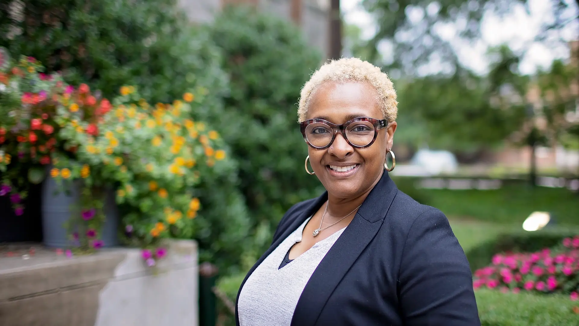
Content Carousel
Display up to six content blocks of similar type and content length in a single, compact location. The background can be blue, gray, red or white and can include images, text and video. This is a great option for displaying multiple testimonials without making the page too busy.
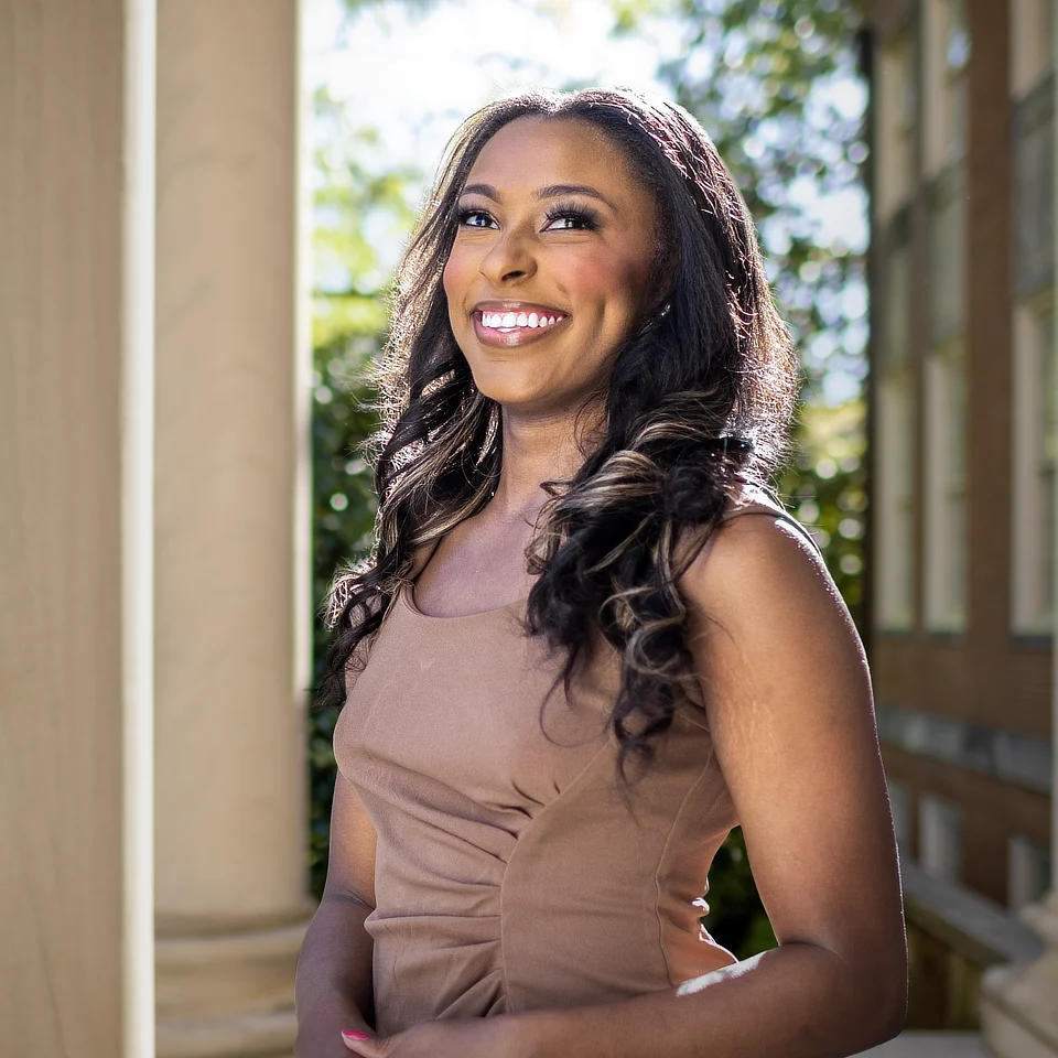
Michelle’s Story
After years of caring for her family, Michelle began her journey in the online program with the encouragement of her supervisor and colleagues. With this encouragement and hard work, Michelle achieved her goal of finishing her college education and earning her degree in Organizational Leadership through Samford Online.
Thomas’ Story
For Thomas Brown, Samford Online was a life-changing experience that prepared him for real-time career growth. With a family and full-time job, Thomas obtained his Organizational Leadership degree, as well as his MSEM. Thomas’ resounding message to anyone considering Samford Online, no matter their stage in life, is to “Go for it! It’s so doable!”
Ashley's Story
At first, Ashley Russell was unsure if online school was something she would be able to accomplish. Thanks to how her professors cared for her and treated her just like an in-person student, Ashley achieved her goal and graduated with her degree in Organizational Leadership. She proudly walked across the stage at commencement thanks to the support of Samford Online.
Gauge's Story
After being deployed prior to his junior year of college, Gauge pivoted his studies from Samford’s residential program to online. While serving his country, Gauge completed his Organizational Leadership degree on time while remaining connected to the Samford community, and exemplified our motto of Learn Everywhere, Lead Anywhere.
Content Box: This example includes a blockquote centered for desktop followed by a button.
Blue Content Box: This example includes a blockquote centered for desktop followed by a button.
Gray Content Box: This example includes a blockquote centered for desktop followed by a button.

Blue Testimonial Box
“Typically used for testimonials, this component almost always includes a blockquote.
“As in this case, it may also include an optional title, paragraph, attribution and button. Testimonial images must be square and may appear on the left or right.”
Name of Person Quoted
Year of Graduation or Job Title
Gray Testimonial Box
“Typically used for testimonials, this component almost always includes a blockquote.
“As in this case, it may also include an optional title, paragraph, attribution and button. Testimonial images must be square and may appear on the left or right.”
Name of Person Quoted
Year of Graduation or Job Title

Two-Column Content Box: Typically, one of the two columns will include visual content like an image, video or VR link.
The other column typically contains complimentary text. This sample includes a blockquote and supporting text on the left and a YouTube video and poster image on the right. Visual content can appear in the left, right, or both columns.
Two-Column Blue Content Box: Typically, one of the two columns will include visual content like an image, video or VR link.
The other column typically contains complimentary text. This sample includes a YouTube video and Samford poster image on the left and a blockquote with supporting text on the right. Visual content can appear in the left, right, or both columns.

Two-Column Gray Content Box: Typically, one of the two columns will include visual content like an image, video or VR link.
The other column typically contains complimentary text. This sample includes a blockquote and supporting text on the left and a VR image link on the right. Visual content can appear in the left, right, or both columns.
Three-Column Content Block
As in this case, this content block may include a title and short description and is used to visually convey congruent ideas in sets of three.

Column One
The content in each column should be relatively similar in length to the other columns to avoid introducing unsightly white space at some screen resolutions.
Column Two
The content in each column should be relatively similar in length to the other columns to avoid introducing unsightly white space at some screen resolutions.
Column Three
The content in each column should be relatively similar in length to the other columns to avoid introducing unsightly white space at some screen resolutions.
Three-Column Blue Content Block
As in this case, this content block may include a title and short description and is used to visually convey congruent ideas in sets of three.
Column One
The content in each column should be relatively similar in length to the other columns to avoid introducing unsightly white space at some screen resolutions.
Column Two
The content in each column should be relatively similar in length to the other columns to avoid introducing unsightly white space at some screen resolutions.
Column Three
The content in each column should be relatively similar in length to the other columns to avoid introducing unsightly white space at some screen resolutions.
Three-Column Gray Content Block
As in this case, this content block may include a title and short description and is used to visually convey congruent ideas in sets of three.
Column One
The content in each column should be relatively similar in length to the other columns to avoid introducing unsightly white space at some screen resolutions.
Column Two
The content in each column should be relatively similar in length to the other columns to avoid introducing unsightly white space at some screen resolutions.
Column Three
The content in each column should be relatively similar in length to the other columns to avoid introducing unsightly white space at some screen resolutions.
Two-Column Blue Request for Information
This sample shows the heading, optional subheading and Slate Request for Information (RFI) form in the left column.
Loading...
First Heading
Additional information about the first thing.
- First Point
- Second Point
- Third Point
- Fourth Point
- Fifth Point
Second Heading
Some more information about a second thing.
Third Heading
Some more information about a third thing.
Fourth Heading
Some more information about a fourh thing.
Fifth Heading
Some more information about a fifth thing.
Two-Column Gray Request for Information
This sample includes the title and an optional subhead positioned above the content columns.
First Heading
Additional information about the first thing.
- First Point
- Second Point
- Third Point
- Fourth Point
- Fifth Point
Second Heading
Some more information about a second thing.
Third Heading
Some more information about a third thing.
Fourth Heading
Some more information about a fourh thing.
Loading...