As a fan of Major League Baseball (MLB), the 2020 season was a whirlwind to watch. A 60-game season. Games postponed and rescheduled. Extended rosters. A designated hitter (DH) for both leagues…and countless other “firsts” for MLB. What did not change? The competitiveness of the players and the desire of organizations to win.
Statistics in sports—and especially in baseball—has grown immensely over the past ten years. New metrics being created, managers looking over binders full of data to make in-game decisions, and announcers offering quantitative summaries of specific on-field action. The game is different than it was just a decade ago and analytics are being used more than ever to gain a competitive edge.
The recent 2020 World Series between the Tampa Bay Rays and the Los Angeles Dodgers was an interesting microcosm of the changing game. Two of the arguably more progressive teams with regard to analytics fought it out for six games. These analytics capabilities helped propel both teams through the regular season (both led their respective leagues in win totals) and playoffs, earning the right to compete for the 2020 Commissioner’s Trophy that goes to the MLB champion.
Analytically-driven roster optimization is an increasing focus of attention in the world of sports, and it certainly has been a focus for these teams. The Rays have been renowned for their consideration of pitching matchups and their use of the “opener” in recent seasons. This tactic involves using a relief pitcher (usually a middle reliever) to start games based on preferred matchups with the top of an opponent’s batting order, hoping for quick outs and to let the more traditional starting pitcher subsequently come in and last longer into the game. Accordingly, they have built one of the best pitching staffs in MLB, which played a huge part in getting them as far as they did in 2020.
The Dodgers are typically viewed as having greater resources than the low-budget Rays. They have a former Cy Young winner, multiple Gold Glove winners, and some of the highest paid players in the league. Similar to the Rays though, the Dodgers also have been noted for their use of depth and versatility to run platoons and create favorable matchups in navigating this (and prior) seasons, driving their sustained run of success.
With such a focus on roster construction and usage, I was excited to watch how the World Series played out with these two teams. I paid specific attention to the different batting lineups: who was in the lineup for each game, what order they hit, and how they adjusted based upon pitching matchups (that is, the handedness of an opposing pitcher on a given night). It left me to consider: Which team has the better lineup? Is the lineup made by the manager the best statistical lineup possible? Can it score the most runs possible by that team?
My prediction was that the Dodgers lineup was generally more potent than the Rays (the Dodgers led MLB in 2020 with 349 runs scored, compared to the Rays 289), but due to the reputation that both teams hold for being statistically-driven, I expected both managers’ lineups to be analytically-derived and have similar characteristics to commonly-prescribed lineup optimizations.
Data Collection
To begin my inquiry, I started by collecting the player rosters from the 2020 World Series for both the Rays and Dodgers. Due to their being a universal DH this season, the batting lineup (nine spots) does not have a pitcher included. With the shortened 2020 season, I included player data for their 2019 season as well to increase the size of each player’s sample. Split data was also collected to see the specific level of play against both right-handed and left-handed pitching.
SEQNZR Technology and Alternative Lineups
I inputted the player data from each team into Seqnzr. Seqnzr is a Python-based, data-driven technology that can run up to 50,000 simulated games on an inputted lineup to get statistics on run production. (Additional background on Seqnzr is provided in a prior article from Samford’s Center for Sports Analytics, available here.) Then, I put in manager’s lineups used by each team for the six games and ran those for a baseline for which to judge my analysis.
After that, I began to look for statistics to use in creating alternative lineups which might optimize run production for each team. After reviewing recent literature, I chose to use OPS (on-base plus slugging percentage) and wOBA (weighted on-base average) for developing alternative, statistically-based lineups, as batting average isn’t sufficient and “traditional” lineup creation has its own limitations.
OPS is a metric measured by a player’s on base percentage (OBP) plus slugging percentage (SLG). OBP gives the percentage a player walks, gets a hit, or gets hit by a pitch divided by the sum of at bats, walks, hit by pitches, and sacrifice flies. SLG assigns a weight to each type of hit and gives that total over at bats. For example, the number of singles is multiplied by 1, doubles by 2, triples by 3, and homeruns by 4. That sum is then divided by total at bats.
OPS = OBP + SLG
wOBA is a measurement used to see the positive outcomes of an at bat multiplied by a given weight for the season that is adjusted based on the average amount of runs scored league-wide. Fangraphs describes wOBA in the following way: “Hitting a single and drawing a walk are both positive outcomes, but they have a different impact on the inning. A walk always moves each runner up one base while a single could have a variety of outcomes depending on who is on base and where the ball is hit. We want a statistic that captures that nuance.”
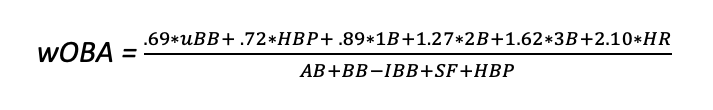
Overall, OPS and wOBA are two of the most sophisticated and respected statistics, with wOBA being a little more complex.
After Seqnzr calculated expected runs scored from the actual lineups used by each of the managers for each team across all six games of the series, I then made two alternative lineup combinations. First, I created a lineup based solely on the descending order of OPS for each team (i.e., the player with the highest OPS was placed in the leadoff spot, the second highest OPS was placed second in the order, and so on). As I was also interested in how the lineups fared versus the pitching matchups, I created additional lineups with OPS, optimized versus left-handed pitchers (LHP) and right-handed pitchers (RHP) for both the Rays and Dodgers. Altogether, each team had 3 OPS lineups: based on combined statistics (irrespective of pitching matchup), versus RHP, and versus LHP.
The approach for generating the wOBA lineup was a bit more complex. I used an idea from a well-known sabermetric researcher, Tom Tango. Tango states that when making an optimal lineup with wOBA, slugging percentage (SLG) and on base percentage (OBP) are also needed. The process for creating this lineup went as follows: Identify the top 3 batters with the highest wOBA, then among that group split them into OBP and SLG. The player with the higher OBP goes #1 and the player with the higher SLG goes #4. With the player left over going #2. (For my purposes, if a player had the highest OBP and SLG, they were placed at the #2 spot because that is proven to hold the best offensive player on the team.) For players 4 and 5 on the wOBA ranking, the higher OBP went #5 and the higher SLG went #3. Players 6-9 were placed in descending order by wOBA.
This wOBA process was done with combined statistics and separately to optimize versus LHP and RHP, similar to what I did with the OPS-driven lineups.
Analysis
In total, 12 lineups were run per team. The figures below display the average runs of each manager’s lineup (games 1-6) as well as the alternative lineups. I color-coded the games based on which hand the opposing starting pitcher threw with (to optimize matchups), and also included OPS- and wOBA-based lineups regardless of handedness (shown in grey) and for specific matchups. As expected, the Dodgers lineups (Figure 1) had a much higher average run production across the six-game series than the Rays (Figure 2) did. The Dodgers did indeed have better position players, and were expected to have greater offensive output each game.
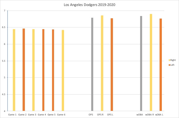
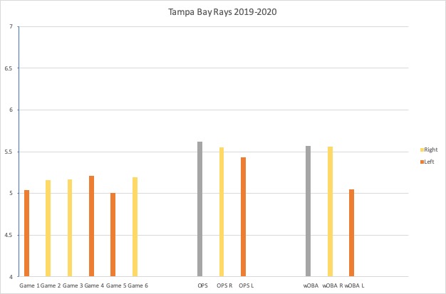
With these being the top two teams in the league, I expected the managers to be using analytics to construct their lineups. I therefore predicted the run production to be similar when comparing a manager’s actual lineup versus one of the alternative lineups I produced. The comparisons weren’t as close as expected. For example, while Dodger manager Dave Roberts’ lineups ranged between 6.42 and 6.46 expected runs per game, the OPS and wOBA lineups produced increased the expected run production to 6.86 and 6.90 runs, respectively. I was able to increase estimated run production when compared to the lineups used by the Rays’ Kevin Cash as well.
Split data was also compiled for each team versus RHP and LHP. This data was collected to see if a team’s run production was stronger when facing different handedness. The run production versus pitching splits similarly followed the pattern I saw earlier, with the average run production for the manager’s lineup typically lower than the optimized lineups.
To more formally test the difference between each manager’s actual lineups and the alternative lineups, statistical t-tests were run. T-tests are statistical analyses used to determine if there is a significant difference between the means of two groups. In my study, I used the means of the runs produced from the lineups in Seqnzr as shown in the charts. Contrary to what I originally predicted, there was a significant difference between all of the lineups created by the coaches when compared to the alternative lineups. The only exception was Tampa Bay’s game used lineup versus the wOBA lineup optimized for LHP (meaning Cash’s lineups versus LHP was not meaningfully different than the alternate one I created using wOBA).
Conclusion
Looking into the two teams from the 2020 World Series, it is noteworthy to see that the manager’s lineups were different than the commonly-promoted, statistically-based lineups. With all the information supporting their analytical nature, it is surely inaccurate to suggest that the Dodgers and Rays are not statistically inclined. It is very possible that high-level MLB teams such as these already have proprietary performance-optimization tools and metrics in place to help them make lineup and in-game decisions. Measures such as health, confidence, and clutch were not measured within the scope of this study, so one would expect that the manager’s lineups reflected their best assessment overall of their players on that given day.
Regardless, my research into alternative lineups has sparked my interest for more research on lineup optimization. It might be interesting to run a similar analysis on the top 5 and the bottom 5 teams in MLB to compare the averages. Even if the mean runs differ, is the gap between the manager’s and an analytically-driven lineup closer or further apart? I believe more teams will begin using lineup optimization (and tools like Seqnzr) because of the opportunities to analyze and predict outcomes and the potential benefits for improving against increasing competition.
References
https://www.mlb.com/stats/https://library.fangraphs.com/the-beginners-guide-to-deriving-woba/
https://library.fangraphs.com/offense/woba/
About the Author
Emily Barnett is a senior at Samford University majoring in marketing with a concentration in data analytics. She is also on the softball team at Samford. Upon graduation, Emily hopes continue her passion working with sports analytics.
Twitter: @embarnett12
LinkedIn: www.linkedin.com/in/emily-barnett