
Student-athletes are busy. When you consider a full class schedule, there is not a lot of time left over for sports. Limited time means that efficient practice is paramount. Practices must be timely and targeted to each player's needs.
So how do you maximize practice with minimal time? How much attention should be given to different areas of the game? Should every player practice the same thing? These are questions I attempted to answer this spring during my internship with Samford’s Center for Sports Analytics, specifically analyzing Samford’s golf team with an aim to lower scores.
Strokes Gained
Golf can be split into four main areas: shots off the tee, towards the green (approach), around the green, and putts. We can measure performance in each using a relatively new metric called strokes gained. Simply, strokes gained compares a player to a baseline/average. Strokes gained can be captured for each shot, but can also measure performance for an entire hole, round, tournament, season, or career. Positive strokes gained means that the player did better than that baseline while negative strokes gained means the opposite. The PGA Tour has adopted strokes gained as a more accurate way to evaluate performance, and I will explain it further below.
To calculate strokes gained, we need to know the expected and actual strokes needed to finish the hole. For example, PGA Tour players average about four strokes to finish four-hundred- and 5-yard par fours. If a player makes a three on that hole, they gained one stroke. If another player makes a five on the same hole, they lost a stroke or had negative one strokes gained. This same idea applies to single shots as well.
From eight feet, PGA Tour players need one and a half strokes to finish the hole on average. About half the time, they will make the putt and half the time they will miss, hence one and a half on average. If a player makes that eight-foot putt, they gain one-half of a stroke because the putt that was supposed to take one and a half strokes only took one. Conversely, if he misses the putt, he loses one-half of a stroke.
If the average score in the final round of a PGA Tour event is seventy and a half strokes and a player shoots sixty-nine, that player gained a stroke and a half for the round. Hopefully, you can start to see how this works.
The sum of a player's strokes gained in each area can also be tracked over an entire career. DataGolf.com has some interesting data on players and their strokes gained in each area throughout their careers.
Data
After each round, Samford golfers enter every stroke into a statistical software. We input where shots were hit from, the distance of those shots, the length of our putts, etc. With that information, the software produces our strokes gained scores in each area. Since August 2022, Samford golfers have played hundreds of rounds of golf. As of this writing, we have collected stats on 602 of those nine-hole rounds. (eighteen-hole rounds are split into two nine-hole rounds). This data was the foundation for my research.
The main goal was to determine which areas are most important, pinpoint where each player needs to improve the most, and ultimately optimize practice.
Regression
Does getting better at putting lower scores more efficiently, or should a player practice their tee shots? The old phrase is "drive for show, putt for dough." This implies that tee shots and drives are fun to watch but putting is where golfers can really make a difference. But now we have data, so let's test which areas are actually the most important in lowering scores.
Linear regressions can answer this question with extreme accuracy. I used R to run a multiple-variable linear regression. In this case, 'score' was the target variable, and each strokes gained area served as an input. The regression coefficients indicate which input has the strongest effect on score. The model suggests that for every one-stroke improvement in strokes gained off the tee, score decreases by 0.97, and for every one-stroke improvement in putting, score decreases by 0.98. The adjusted R-Squared of this model was 0.96 which means that the model is a great fit, and almost all variance in score can be explained by these inputs. These results imply that "drive for show, putt for dough" was accurate for Samford golfers this year, and improving putting is a more efficient way to lower scores.
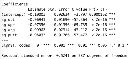
Studies done with larger samples on the PGA Tour tee shots are more important, so I plan to use this model again to see if it changes. There could also be a reason we get different results than PGA Tour players, like the courses we play, Alabama weather, etc.
Tournament Recap Template
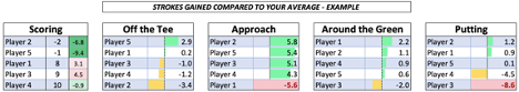
The Tournament Recap Template highlights each player's recent performances. The template is comprised of three tables of varying complexity that spotlight what each player did well and poorly in each tournament. With this information, each player knows where to focus the next week, and Coach DelGreco can format practice more intentionally.
After each tournament, the data from those rounds are pasted into the recap template. As I mentioned, the template instantly produces three tables: the first being the most elaborate and the third the least complicated.
Table 1 shows each player's score and how that compares to their average. Further, it compares the players' performance in each area to their average performance. Instead of the raw numbers, each player's performance is compared to his own average because every golfer is different. 0 strokes gained in one area may be an improvement for one player and a disappointment for another depending on their strengths and weaknesses.
Conditional formats are set so that performances above that player's average receive a green bar, below-average returns a yellow bar, and losing 5 or more strokes in one area alerts the player with a red highlight.
Further, performances compared to their average in each area sum close to the total score compared to their average. This means that if a player scored 10 strokes better than their average, they could see that 5 strokes of that improvement came from putting, 3 came from driving, etc. Players can easily see which areas contributed to the improvement or deterioration of their score.
Table 2 displays the same information in a different format. Table 2 is strategically sorted so that a player can quickly see each of their strokes gained scores in one row. Red flags accompany areas where a player lost a significant number of strokes and green flags where players outperformed their average. Team totals are also listed at the bottom, mostly for the coaches' view. For example, if the team's strokes gained putting total is well below average, the signal is pretty clear; we need to spend more time on the practice green before the next tournament.
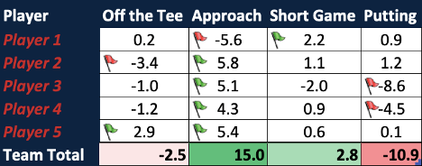
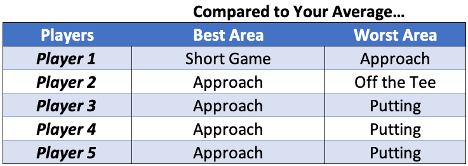
Table 3 is the simplest. This is for the 'old-school' player that does not care about the numbers. Very quickly and easily, each player can find what they did best and which areas they need to improve. If Coach DelGreco wants to split players into groups based on the areas they need the most work, he can easily do so with this table.
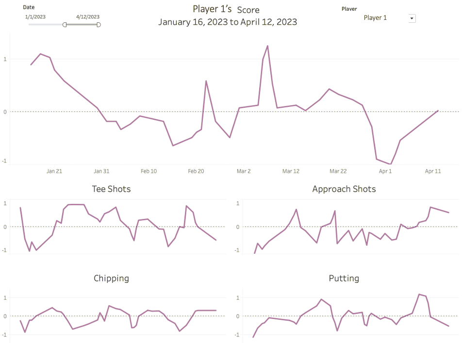
Dashboard
The final 'tool' used to analyze performance is called the Player Trend Dashboard. The Dashboard is a series of line graphs showing any player's performance over a set period of time. The Dashboard is customizable, so it can show any time frame and any player(s). It also helps to visualize trends in players' performance in different areas. For example, if I hit my tee shots poorly at a tournament, the dashboard shows whether I have been slowly getting worse or if this poor performance was random. Visualizing these trends on a dashboard can help detect the peaks and valleys before they happen.
Conclusion
In my opinion, the easiest way to lower scores is to go after the 'low-hanging fruit,' or the area where the player is already struggling. In other words, it should be easier to get back to average than improve your average. The Tournament Recap Template indicates when someone performs better or worse than average. Three tables of varying complexity all show the same data. With this information, they can dedicate time to that area to improve it back to their average. When we can pinpoint which area costs a player the most strokes, they know exactly what they need to practice.
Throughout this internship, I have learned that it is not always about what I think. The goal of sports analytics is to take data and present it in a way that makes sense. In this case, it had to make sense to my teammates and coaches. There were multiple occasions where I presented a table or visual that I was excited about, but confused reactions revealed that the data must be simplified or expressed differently. Some players enjoy and understand the complex visuals while others value simplicity. That is why there are three tables in the Tournament Recap Table. The goal is to present data that is understandable and useful for the audience, not for me.
About the Author
 Matthew Madden is a senior student-athlete at Samford University. He is studying economics, sports marketing, and data analytics. Connect with him on LinkedIn.